There are some specific points in the scenario of conviction that will allow the landing page to gain visitor’s attention, interest, desire, trust, action, and satisfaction. Take advantage of what you have!
If you have the following question popping up What is a landing page? we suggest to look through our article Landing Page Review and 12 Zen Tips for the Best Landing Page Design.
In the digital world, we have just some seconds to impress the visitor. Therefore, obtaining a high convertible landing page means to gain leads and customers. In order to achieve this purpose, we need to take into account the following elements:
1. The Headline of Your Landing Page
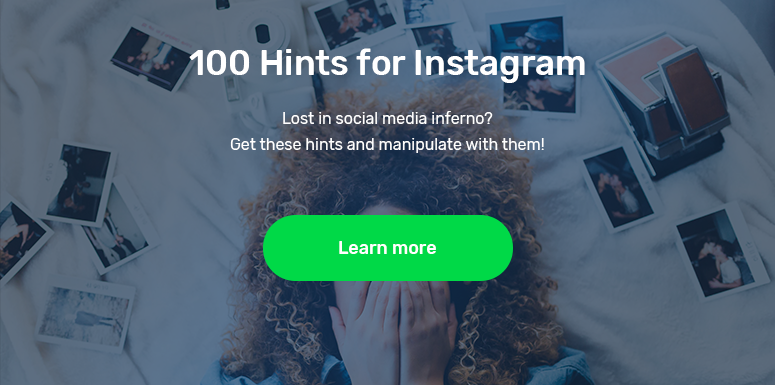
The headline should contain the real advantages of the product, and the subheading- the positive details. They will work on enhancing the visitor’s interest. The headline needs to be simple and straight to the point. You need to avoid the visitor’s confusion. Your role is to direct him to the CTA button.
Example:
100 Hints for Instagram
Lost in a social media inferno? Get these hints and manipulate them!
2. CTA Button
It needs to be big and emphasized. It may be highlighted in such a way by directing the visitor’s attention toward the button through the presence of some arrows, pictures, people pointing at it, etc. The statistics stand for the idea that the contrasting colored button is enticing to the visitor. The most fitting colors are green, blue, and orange.
3. The Congruence in Your Design
What you need is to connect stylistically all you have on the landing page:
- The ad, message, image, offer, and topic should be logically and harmoniously linked;
- The researches prove that videos, authentic testimonials, and the display of the product acting in the proper context increase the conversion rate by up to 80%;
4. Original Images
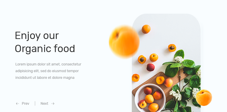
Avoid the use of outdated and over-known images. Even if the movement content is important, images draw out emotions and help to persuade the users to take action. There is an example.
Note! The Perfect (Image+Text) = High Conversion Rate
5. Display Your Social Status
Leave the visitors the possibility to share your landing page via social networks, e.g. Twitter, Facebook, etc. Let the customers know who uses your products. For instance, if you have famous people being your users, do not hesitate to place some of their opinions or even “their words about your product” on the page.
6. Stand for the Customer’s Comfort
- Avoid placing too many elements on a single page that will quickly bore and distract the audience from the main point;
- Insert trust icons and signs on the page;
- Offer the mobile version for your page;
- Furnish the free trial period;
- Emphasize the value of the product;
- Loading time carries weight; thus, make sure that a visitor spends a few seconds loading the page otherwise, you will lose him.
7. Optimize Your Form Fields
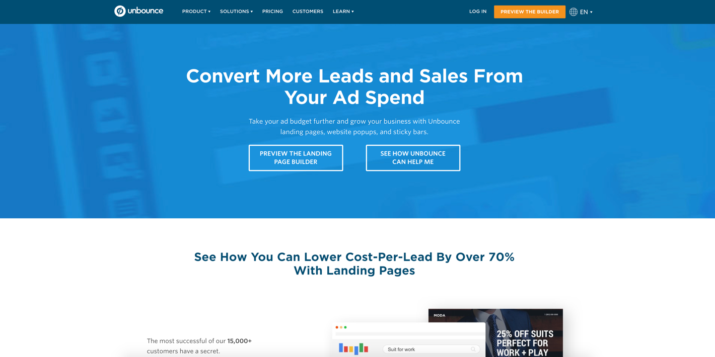
The marketers mention that having a field for asking for the email addresses in your form brings much more chances for a successful conversion than asking for contact numbers. Not to forget that visibility and actionability are the 2 pylons when it comes to landing page optimization. Be inventive when designing the forms.
Example:
Unbounce is at the top of the best landing pages, pay attention to the chat design of their form.
8. The Complex Testing
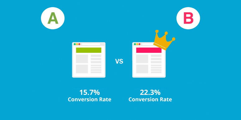
A/B testing helps you to understand what suits your users. There is a great impact when it comes to testing some points on your landing page, such as image, form, etc. Improving some tools on your landing page contributes to increasing the conversion rate by up to 200%.

