The psychology of colors plays a much more important role than we have ever believed.
WHY?
In digital design, color combinations decide whether the customer will be persuaded to purchase the item or not. There is research made by The Seoul International Color Expo stated that 92 % of the visitors agreed with the idea that Colors are important when it comes to online web design.
There is not just this proof. We would say that the art of playing with e-commerce color schemes is a kind of psychology in web design. Colors help to keep in mind specific brands, as well. Do you remember McDonald’s logo? Red. Puma’s logo? Black. You see how colors help the visitors to become confident enough to return to the specific webpage.
It is an acknowledged fact that this “science” is subjective and not precise to a great extent. There are stable boundaries that are valid for some dimensions, such as preferences, age, gender, etc. This is why companies tend to select the colors that suit most of their products, emotions, and audiences.
Which Message does the User Perceive If Adding Those Shades in Color Combinations?
- Orange
This color offers a sense of enthusiasm, energy, affection, creativity, and stimulation. - Yellow
It strives to transmit happiness and stimulates the user’s energy and loyalty. Not to forget to mention is that its overuse can indicate danger and rejection. Thus, it is significant to be careful when adding yellow in various color combinations. - Green
Green stands for safety, goodwill, stability, cleverness, fertility, emotional strength, quietness, sincerity, positivity, and freshness. - Pink
Pink produces a calming effect. Even if the stereotype denotes its femininity, the effect it produces can decrease the power of the strong male colors. Psychologists say that adding pink to e-commerce color schemes can relax human muscles. - Red
It can interfere with the deepest level of emotions. Red is associated with passion, danger, love, and desire. It is known that this color has the force to grab attention and mark something. It contributes to blood pressure rise. - Purple
It is associated with royalty, luxurious life, aristocracy, mystery, originality, influence, and intellect. The correct use of purple leads to a good conversion rate. - Blue
Researches show that blue is the most favorable color for both women and men. Taking into account the fact that blue decreases appetite, it is not advisable to use it in the hospitality sphere. - Gray
It provides a sense of seriousness and conservatism. Gray can serve as a nice background for more alive colors. - Black
It suggests the idea of power, control, and domination. Its use presents an ensuring message to the users. - Brown
It serves to detect protection, treasure, and confidence.
The significant point is to combine the colors efficiently in such a way as to get the targeted result. Another important point to be noticed is that there are color combinations based on the color agreement levels.
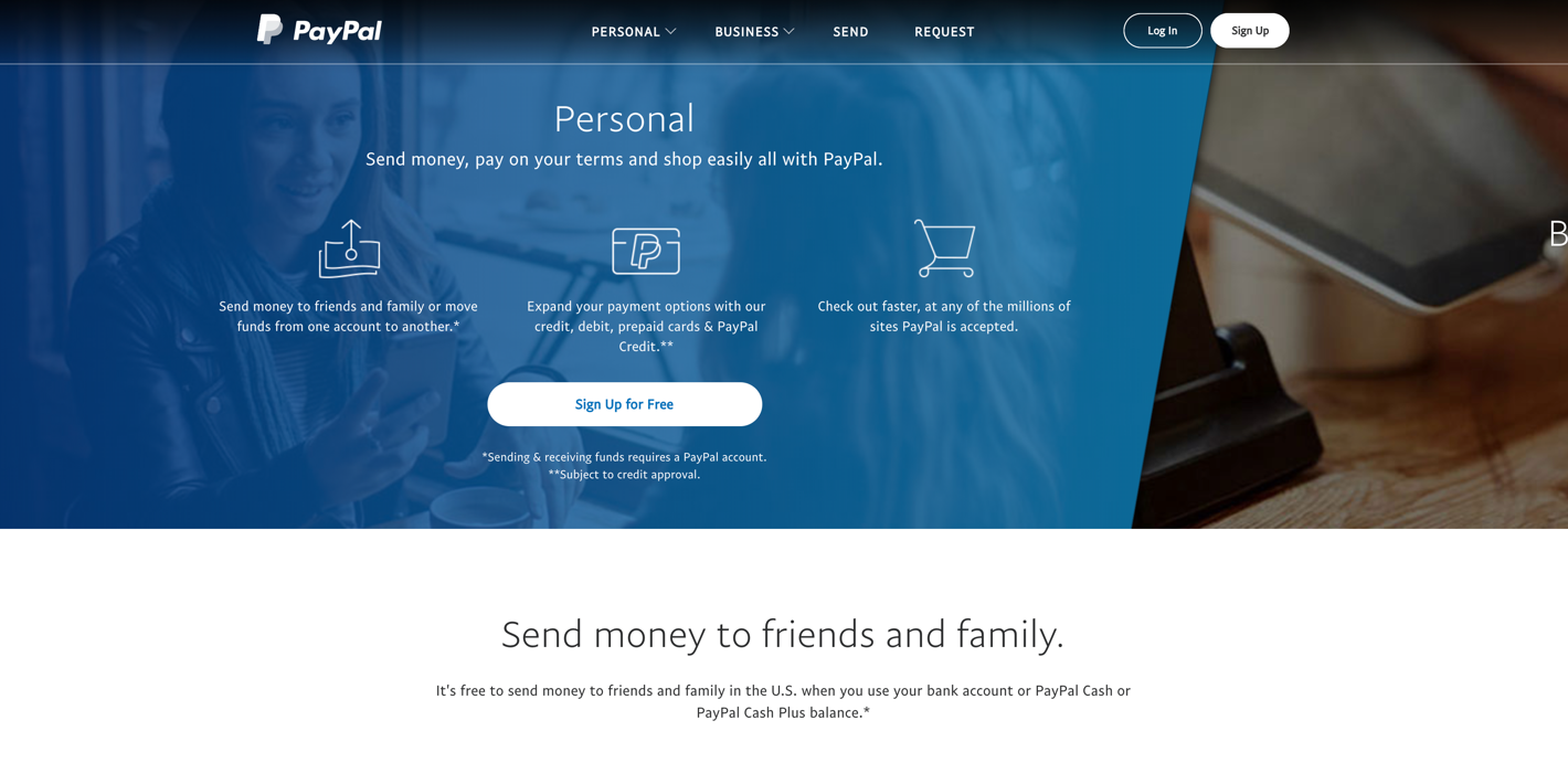
Look at the example below in order to notice a trustful color combination with blue on PayPal.
On the other hand, we have provided an awful example of a disturbing color combination. It can help to inform you about the way you need to avoid when selecting the best colors for e-commerce.