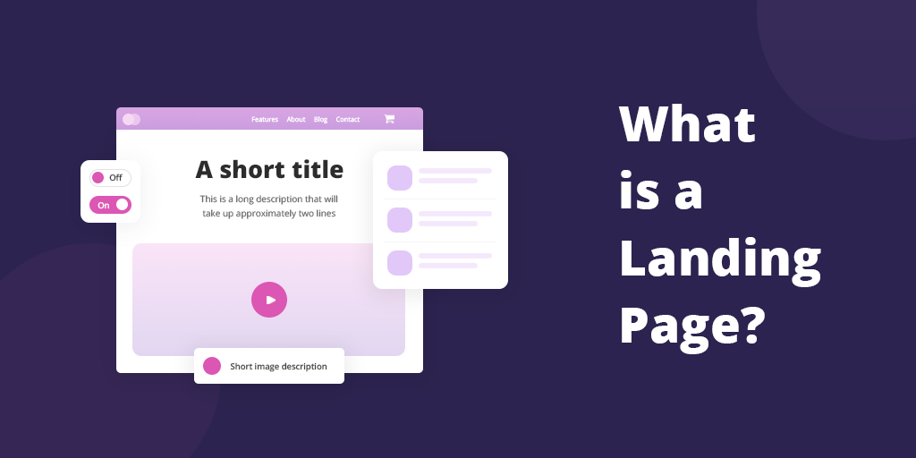
Landing pages are well-known as a term which is specifically used in digital marketing and advertising. Its independent goal is to Call to Action (CTA) the visitors – to get them involved by:
1. signing up for your mailing list;
2. creating an account;
3. pre-purchasing your product;
4. offering their personal data, etc.
How can I Distinguish a Landing Page from other Webpages?
A visitor or a potential customer comes across to an independent page which hints at the following points that deal with landing page optimization:
1. NO more than one link;
2. NO navigation bar;
3. NO disturbing images or data;
4. YES for the message suitable to the advertisement;
5. YES for an original headline;
6. YES for a video and other visuals that will prove the quality of your product;
7. YES for a heading dedicated to the testimonials that would contribute to the process of persuasion.
Are there some Landing Page Examples or Types?
Even if some marketers say that there are 3 types, the acknowledged opinions regarding landing pages are closer to support the idea that there are 2 ones.
1. Lead Generation Landing Pages
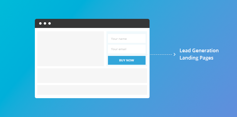
Firstly, they are designed for collecting lead data such as e-mail addresses, names and secondly, for CTA. The 3rd type of landing page, known as “squeeze page” is also used to describe the lead generation landing page.
2. Click-Through Landing Pages
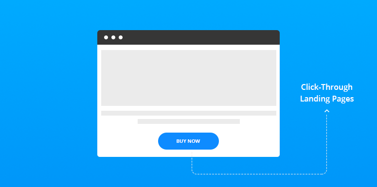
They are used for e-commerce, and they are created with a single aim to – Call to Action. The page is ready to offer details in order to inspire the visitors to click and buy.
Why do I need a Landing Page?
- To Increase Conversion Rate
There is a study made by Omniture which states that landing pages have a potential of 25% in gaining traffic to your website.
- For Focused and Leaded Messaging
The landing pages are focused on messaging. Thus, they can get rid of much confusion that low conversion produces. Being an independent structure, landing pages help to find the most suitable design. For instance, the users will provide their opinions regarding some issues or questions of the page via A/B testing.
- For The Controlled Stream of Updates
The homepages, in contrast with the landing pages, can be affected by the automatic updates. There is a risk that not all of them would be in accordance with your paid ad message.
- For the Independence of Your Business
Don’t you think that it is easier to promote your products or services independently rather than using Amazon or other websites that charge you?
- Because of No Design Dependence
You are free to choose the design of the landing page which may not be according to the design of the entire website.
- For Providing Credibility
Getting a specific task, objective or path for users, landing pages help them to recognize that you understand their problem, and you are more likely to start the action.
- To Boost SEO
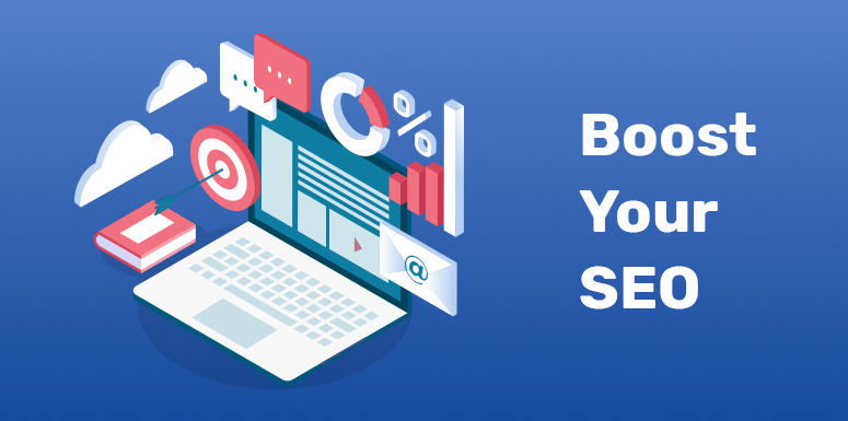
Presenting good information on landing pages will contribute to a relevant search engine ranking.
Which are the Tips for obtaining the Best Landing Page?
There are some specific points in the scenario of conviction that will allow the best landing pages to gain visitor’s attention, interest, desire, trust, action, and satisfaction. In order to keep the visitor’s interest, we need to take into account the following points when it comes to how to create a landing page:
- The title should contain the real benefits of the product and the subtitle- the positive details. These details will increase the visitor’s interest and will make him feel that he really wants to get this product/service.
- The CTA button needs to be big and emphasized. It may be stressed in such a way by directing the visitor’s attention towards the button. Some arrows, pictures, people pointing at it, etc. can help in doing thins.
- The ad, message, image, offer, and topic should be congruent.
- Using videos, adding authentic testimonials and showing the product working in the proper context increase the conversion rate by up to 80%.
- Avoiding the use of old-fashioned and over-known images.
- Leave for the visitors the possibility to share your landing page via the social networks, for instance Twitter, Facebook etc.
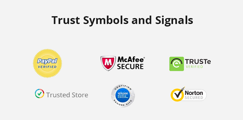
- Trust symbols and signals on the page.
- Make Your Page available for Mobile versions.

- Keep Your Forms Short.
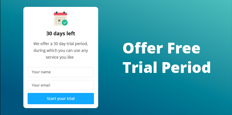
- Offer the Free Trial Period.
- Have the contrasting colors on your landing page.
- Avoid placing too many elements on one page.


