First of all, what comes into your mind when you hear Call-to-Action? Is it just a button that demands you to press on it? Obviously, not just that. So, what is CTA? According to CTA marketing, it’s a dichotomous structure with 2 imperative aims because:
- it shows someone what should be done, and
- it provides the reasons why someone has to take action.
There is powerful evidence in the global CTA digital marketing which presents the rules of crafting the best buttons that work for a productive conversion rate. In this blog post, our intention is to provide you valuable data related to excellent tips for crafting the best Call-to-Action buttons. Find the hints related to popular Call-to-Action examples!
Take a look here! Moreover, you can look through the lines of our blog post entitled 4 CTA Samples to Be Applied. Absolutely Helping to Convert in order to get more insights.
1. The Architectural Combination of Color, Shape, and Size of the CTA Button
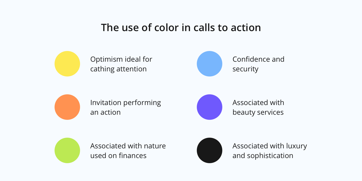
Your aim should be the number of clicks of your CTA button. Thus, make it stand out by using the right colors (red, green, blue colored buttons), the prominent shapes which will give it the click-ability (rectangle shape with definite borders, white space surrounding the CTA button, and contrasting shade).
The suitable size should be not too small to appear overlooked, and not too big to be disturbing. Don’t forget that one of your objectives should be to maintain the contrast button- background.
2. Guess the Prospects’ Confusion
The researches show that simple designs have better results than those which are more sophisticated. Your CTA button should respond to the prospects’ needs and potential questions. Therefore, you have to put on your customer’s shoes in order to guess and avoid their confusion.
3. Add Genuine Words
You should know that people believe people, not brands. So, your customers will be more likely to take action when seeing some social proof, photos of the customers. They would recommend your items or services, or testimonials next to the button.
4. Offer Your Customer the Option to Select
It is something pleasant when you have the opportunity to select between more than 2 choices. But the surveys show that the level of the customer’s satisfaction after choosing between 3 and more options is lower than choosing between fewer options.
5. Optimization
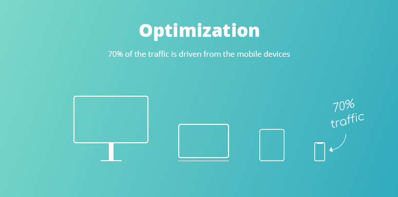
Think about the mobile versions. Nowadays there is a true fact that about 70% of the traffic is driven by mobile devices. Consider the risk related to a huge CTA button appearing on the small screens.
6. Include Action Words
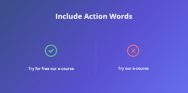
The CTA words and action verbs are useful for motivation and persuasion when the aim is to get users involved. They also help to direct the customers by telling what to do and the benefits of doing so. For instance, “Try for free our 14-day e-course” seems to be better engaging than just “See our e-course”.
7. Select the Right Pattern
Depending on your audience, you should design the most suitable pattern. Adespresso suggests that among these are: Do this, Do this by Doing this, and Do this because of this.
8. Set up Your Approach
Even if digital marketing has stood for the fact that using negative words in your campaign can have a negative impact, the new approach deals that issue differently. So, you can use properly this strategy, to provide benefits and advantages for using your products.
9. Keep It Short
Your CTA should be not too long and not too short. It should provide the necessary information avoiding to overwhelme the customer. Also, for a better conversion, it should contain the sense of urgency and the words of a specific offer.
10. Speak from the Customer’s Behalf
That’s a new tendency to use the first person. For instance, look at the call to action example. “Try my free e-course” is more appreciated by the users than “Try free e-course”.


