
We’ve stated that your landing page is your carte de visite. Right? It seems that you see your carte de visite as being almost perfect, but anyway something goes wrong… The conversion rate is decreasing daily. Why?! That’s the question!
For fixing this issue, you have to find out your mistakes. The following list will help you to identify what you do incorrectly. Keep your eye open!
In our blog post Landing Page Review and 12 Zen Tips for the Best Landing Page Design, you will discover amazing things about the absolute elements of a landing page. We suggest reading it before going through the top 7 mistakes to be avoided. It will make clear many things you have found difficult.
1. The 1st Impression is not Intriguing at All
Your landing page has 10 seconds to persuade the visitors that it is wealthy. Otherwise, you’ll lose them. In order to check these limits, take a look at Google Analytics data. The catchy, explanatory headline (not a trait-focused one), appealing design and persuasive message are the hooks for a landing page optimization.
2. Call-to-Action is an Eyesore
Do not believe that if you add several CTAs, the visitors will find their suitable option. Vice versa, you’ll confuse them. Therefore, the only way to solve the issue will be to leave you. Invest time and creativity in your CTAs.
3. You don’t Have the Target Audience for a Good Conversion Rate
The researches sustain that it is impossible to produce for everyone. This is true because there are peculiarities of age, gender, professions, etc. Moreover, you should design several landing pages for each category of your audience. If you don’t believe me, try A/B testing!
4. The Visitors Claim: “Valueless Page!”
The customers are not in need of hi-tech information regarding your products or services. They need real benefits! How do their lives change if they keep in touch with your brand?
5. Not in Vogue Design
In case your landing page lacks a sense of coherence and fashion, the conversion rate optimization will bear the failure soon. The surveys say that the white space throughout the page and the layout are vital. The conversion marketing denotes that you do not need the boring details that distract your visitor from taking action.
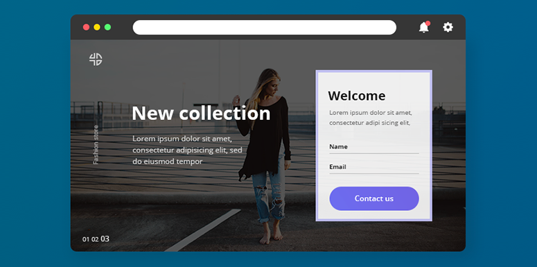
6. Lack of Images
The pictures are perceived much more quicker than texts by the human brain. Not only the images are attractive, but they even boost the conversion rate by up to 25%. Another significant point would be not to use stock photos but to invest in the authentic ones.
7. Not Presenting Your Stuff
Even if the marketers are accustomed to seeing the products daily, this thing does not go right with the visitors. They should get in touch with some images or screenshots related to your services or products before purchasing them.
8. The Forms to be Filled in Are Endless
The perfect landing page builder would stand for receiving something back from the customers, for instance, their email addresses, their niches, etc. Getting too many spaces to fill in causes the visitor’s leaving. The solution of the trouble is to use forms that occur in several steps.
9. Mobile Versions are Creeping “with the Speed of a Rabid Snail” 😀
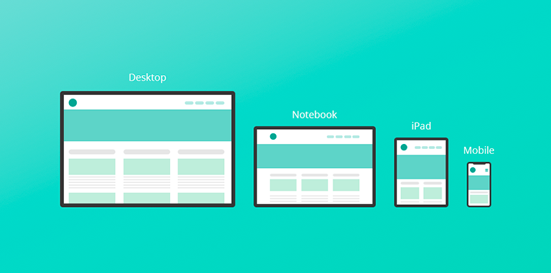
There is a study made by ConvertMedia expressing that 45% of data is offered through the mobile devices. The search engine marketing says that if your landing page is not responsive, you should smash all the fences for achieving an effective mobile conversion.


