A sales page is an independent page created to secure products and services sales. The aim of the sales pages is to convert visitors into clients. In simplified terms, a selling page is a perfect location where you trade goods.
Quora comes with a brilliant scheme that shows the way things need to be fixed in order to produce effects:
- Ad – Landing Page – Thank You Page – Sales Page
- Visitor from Google – Home Page – Landing Page – Thank You Page – Sales Page
It is a little bit confusing because a question may come in someone’s mind. “Can a sales page be a landing page at the same time?” Yes, because:
- of the common elements;
- a sales page is a model of a landing page;
- you “arrive” on them from another page/website;
- landing pages cannot only capture leads, but they also can sell…via sales pages;
- landing and sales pages perform their specific functions; this is why they are named in the way their functions are;
- neither sales pages nor landing pages contain some specific elements, e.g. navigation menu, footer, sidebar, and external links.
For more insights related to driving traffic and increasing conversion rate, we suggest reading the blog post Sales Page Conversion Rate can Boost Using These Top 10 Tips.
Why do we call it Sales page?
Marketers say that sales pages are named in this way more likely because of the function (to finish the sale). It is actually the most difficult to obtain because it goes after the conversion. That’s the most valuable for marketers and the most constraining for visitors – the sale.
How many types of sales pages are there?
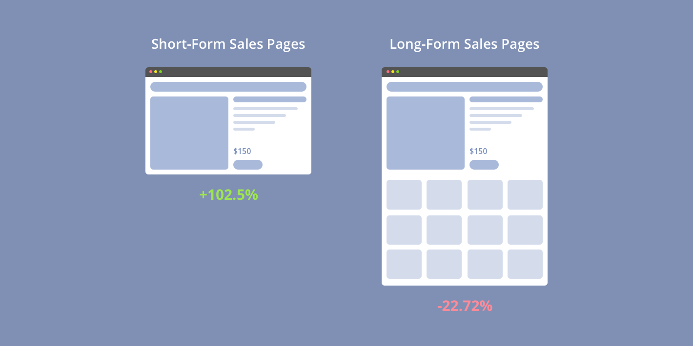
Sales pages are considered to be a separate category of landing pages. Therefore, there are 2 standards:
1. Long- form sales pages
These are necessary when:
- Your product or service turns to be expensive;
- Your product or service is too sophisticated;
- Your audience has a low-level of appreciation regarding your product/service;
2. Short- form sales pages
This type is used when your pages are doing well. So, there is no need to push the customers to convert, especially when:
- They are highly appreciative regarding your product or brand;
- Your product/service is fair;
- Your product/service is not expensive;
- Your product/service is not risky;
Both types of sales pages are designed similarly. They contain a product approach that users go through and decide whether they want to click the call-to-action (CTA) button or not.
What is a sales letter?
A sales letter is nothing else but a long-form landing page. The objective of this page is to carry on all the data about the proposals so the visitor can make the optimal conclusion.
The short and long sales pages have similar elements, but one point that differs is the fact that the long-form pages have the copy. The length of the copy makes the long-form sales page long. That’s the reason why it is important.
You can face the risk of missing the audience!
There are some reasons that can help us identify a bad model of sales pages. So, below you can find the relevant clues that need to be avoided when designing this specific type of pages.
- the unpleasant layout;
- low readability;
- the copy does not correspond to the entire design;
- the probability of getting scammed is high for the long-form landing pages; thus, the audience is exposed to lack credibility.
- just one illustration on the page;
- the diffused font;
- cheaty design;
- distractions;
- lots of navigation links, which may provoke the risk for visitors’ departures.
What Should I include on my Sales Page?
1. Headline
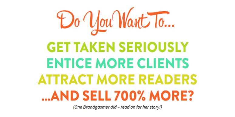
- more extended than on a typical landing page;
- needs to focus on the visitor’s eye;
- makes the visitors keep on reading.
2. Copy
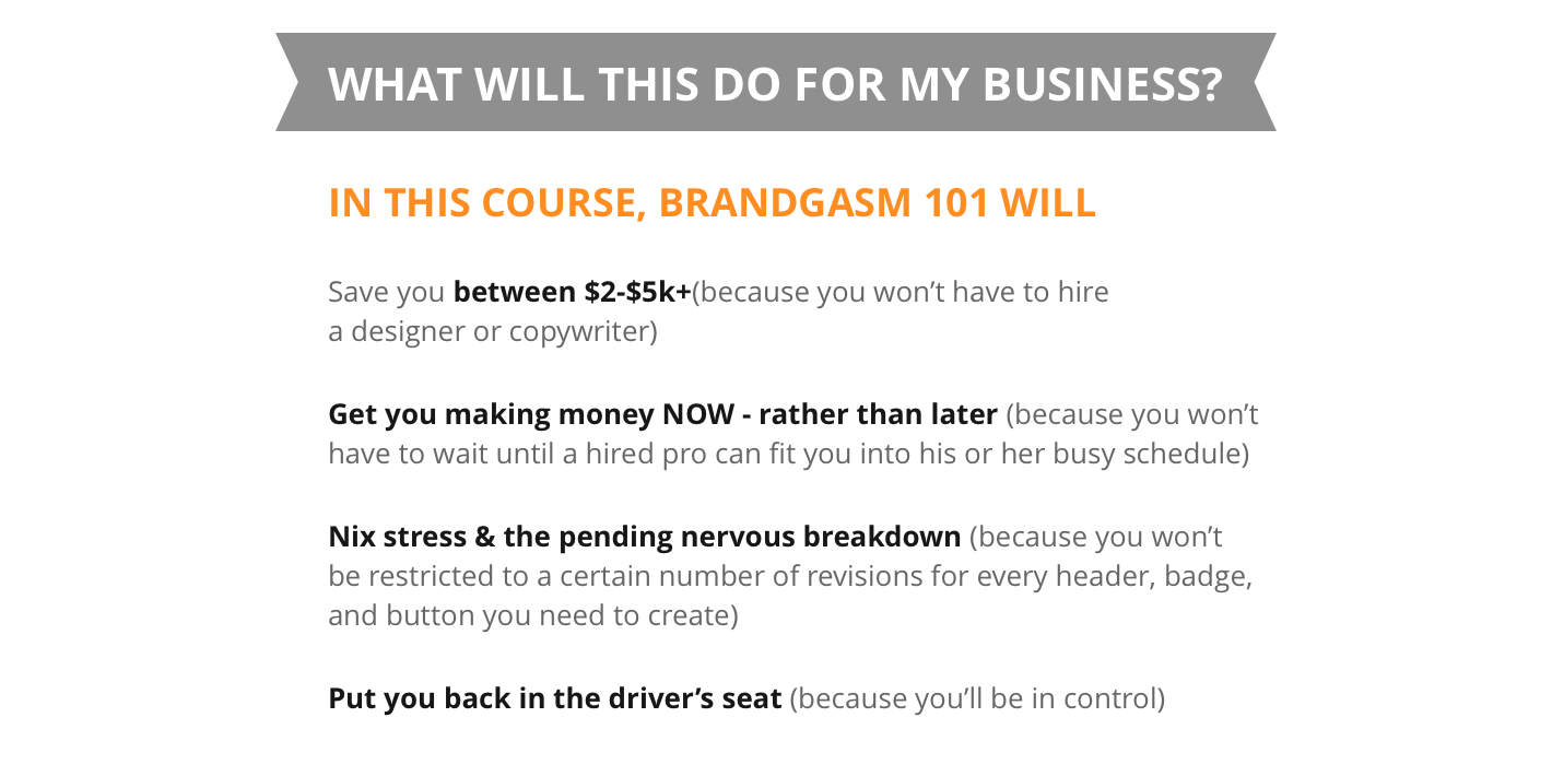
- for enhancing the readability;
- its arrangement should be attractive;
- the colors should be contrasting in order to be highlighted.
3. CTA button
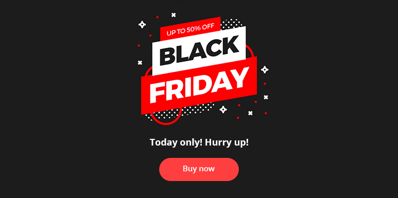
- multiple CTA buttons throughout the page;
- contrasting color;
- should have an engaging copy on it.
4. About us
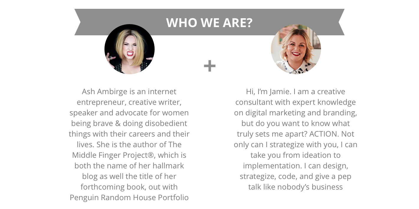
- to enhance credibility;
- the offer would become more social.
5. Testimonials
- social proof regarding the product;
- contribution to the efficient persuasion;
- for gaining trust.
6. Video
- for ensuring the fact that visitors have found what they need;
- getting thankful and satisfied customers;
- increasing the conversion rate.
8. A/B testing when you want a change
As a result, you are free to choose the winner variant between the 2 ones you have. You can test almost everything on your page, for instance, page length, CTA button color, headline, etc.


