In online marketing, the term conversion rate is used to denote the percentage of persons who are ready to press the CTA button.
The persons who arrive on your sales page are here just because they have clicked on a referring link. They’ve found something interesting in their email or on an ad. Then, they are getting filtered on several divisions in the sales funnel. The remained portion of traffic consists of customers who have their minds set on possession.
There are 10 tips for increasing your Sales Page Conversion Rate…
1. Formulate a brilliant headline
This is the first item a user pays attention to. Thus, it is one of the most significant points that need to be originally designed. Some ideas require your consideration:
– Kissmetrics says that having 6 to 12 words enhances the conversion rate;
– the headline should present your product clearly in such a way that the visitors will know what they can find on your sales page;
– it is supposed to be catchy because, in the myriad of websites, your headline should grab the visitors’ sights and keep them on reading;
– even beginning with the starting point it should promise a value.
Examples:
- What you should know about…
- The myth about…
- Do you know the Quick Way to…
- Top 10 tips to…
2. Make your CTA Button look captivating
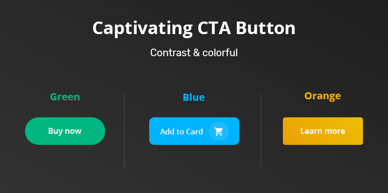
In order to increase the conversion rate, the CTA button should be highlighted with a contrasting color. You can insert several CTA buttons throughout your page. This thing will leave the opportunity to the users to click on it whenever they feel comfortable. Pay attention to the:
- color=> the best are orange, blue, or green;
- size=> choose the proper size and layout, and do not risk to push the visitors to find your button, and do not intimidate them with big ones;
- message=> show your customers that they are in need of your product!
3. Be artistic with the details of the product
The description of the product should be clearly structured and organized. In such a way it will be able to answer the question which may appear in user’s brain, e.g. “`Why is your product useful for me or my company?”, or “How can it really discount the issues I have?” Acting in this way gets the users interested and finally, convinced.
4. Share emotions throughout images

The image is a MUST nowadays because it opens access to the user’s emotional awareness regarding the product you want to advertise. According to the research conducted by 3M, the brain processes images almost 60000x faster than text. Insert images that are suitable for your design and product. You need to have a professional and trustful sales page. Therefore, avoid user’s confusion.
Do you need some specific key options?
Selling successfully a digital download=> craft an imitative feature on the page;
Getting people to sign up for a webinar=> bring out a screen cap of the webinar;
Selling a service=> use qualified images.
5. The right Font
The font you use on your page is a key to success because its purpose is to make the user feel relaxed and comfortable, ready to absorb the information. The goal is an easy to read, adequate, and sane font. The top ones are Arial, Verdana, Tahoma. The font size should be about 12-14pt. It should be neither too big nor too small.
6. Testimonials
Customers’ opinions are more likely to be believable than the business owners’. Help them to trust in your product. Do not hesitate to leave them the opportunity to share their impressions of your product.
7. Finite time offer
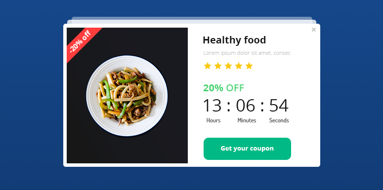
Finite time offer will push the customer to think about the risk of running out of the product. Thus, a doubtful user will be more likely to try your product or service rather than regret afterward. Or, you may provide them with coupons that may expire soon.
8. Reduce the price
The statistics show that having a price which ends with 5 or 9 after the decimal point increases the conversion rate.
For instance, having the following prices in front, we can deduce that the 1st and the 2nd ones convert more:
- 17.95
- 17.99
- 18.00
9. Targeted traffic
This point is very significant because you do not need a mass of uninterested people who are just wasting time wandering on your sales page. The targeted traffic brings you higher chances to get buyers. The statistics say that the traffic from the simply websites comes to be less target oriented than the traffic from search engines.
10. Keep the visitor focused on the importance of buying your product
- NO overwhelming material on the sales page;
- NO distractions;
- NO external links or ads.

