There are specific requirements when it comes to designing the best Facebook ads. They should be clear, goal-oriented, not overwhelming, not boring, and a bit funny. That’s exactly what is needed.
In this very blog post, you’ll learn how to design the best Facebook ads. At the same time, you will discover how to avoid advertising mistakes on Facebook!
1. Don’t Have an Aim? NO-Win!
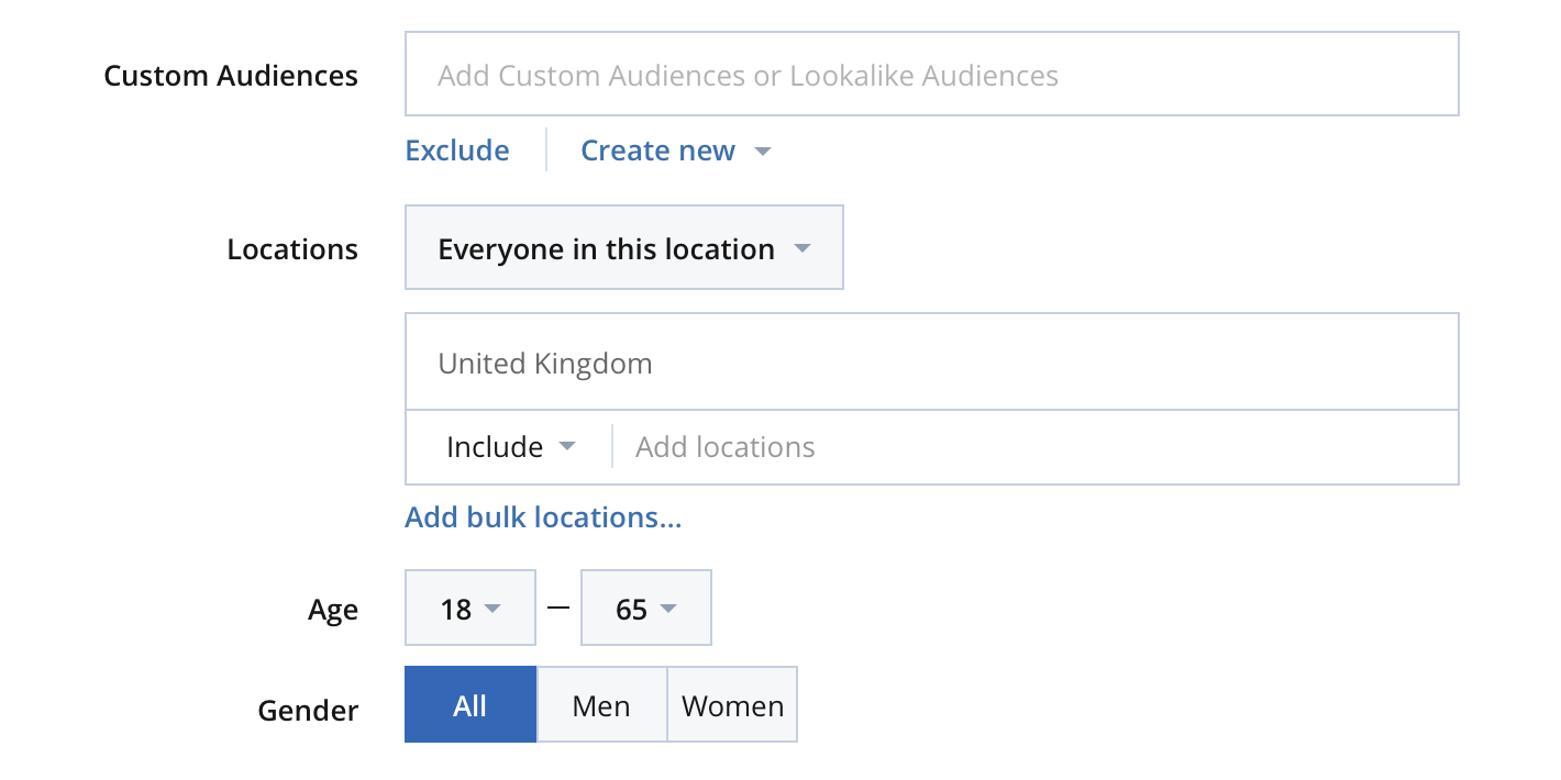
Your goal (e.g., this can be awareness, new customers, or fame) should give birth to your strategy. Facebook suggests that depending on your aim, you should target the right audience, location, and place of your ad. Another important point to consider is that the insertion of aim is not necessary just for photo ads but for Facebook video ads, too. In addition, the Facebook video editor makes it even easier for businesses to create engaging video ads tailored to their specific goals.
2. Dull CTA?
As we have mentioned in the previous blog posts, the CTA button is very significant in terms of persuasion your customers and achieving your target. The most impressive Facebook ad examples sustain the applicability of the following concerns:
- direct and strong call;
- emotional implication (involving emotional facets, such as “joy” or “surprise” words);
- collar-grabbing and intriguing power.
3. No Specific Style

It is important to keep the Facebook ad authentic and focused on a specific goal. The following keys can help you to achieve a great level of optimization when you are going to create a Facebook ad.
- the format of your ad display needs to be landscape;
- avoid the combination of blue and white because they can make your ad lost on the “Facebook field”;
- add priceless text content to your image, but not too much, e.g., the word “Free”, dollar icon, discounts, or time-limited offer; it should encourage the CTA as soon as possible.
4. Not Testing Your Content
The purpose of testing is to discover the best variant of a sample. For instance, you can try A/B testing of your content. Afterward, you will get the feedback results. Their aim is to offer proof related to the most tempting impact perceived by customers. It can be seen in the reaction to your CTA.
5. The Wrong Image

A wrong image can be decisive for your Facebook ad campaign. Take into account the list of peculiarities related to the ad.
- it should be simple and attractive;
- it’s not compulsory that the image would relate 100% to your product;
- find time and patience to change it if it is essential.
6. Dying Headlines
59% of people read just the headline of an ad. Therefore, it should be catchy and offer great value. It should contain a clear CTA, as well (e.g., Are you ready? Tips to Succeed, etc.).
7. Not Eliminating the Converted Persons
A Facebook ad campaign is normally dedicated to a specific audience- the persons who are new to taking action on your call. It is really easy to identify these people. The necessary step is to design a list of those who entered the Thank You Page by using the Custom Audience option.
8. Not Using all the Insights
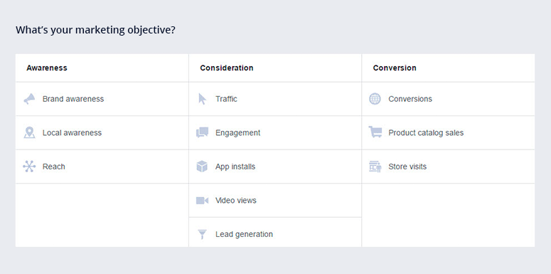
You should take advantage of the provided list of tools and opportunities related to Facebook ads. In such a way, you will be able to guess the prospects’ needs and preferences. Facebook Ad Manager answers all the questions regarding CTR, Cost-per-click, Reach, etc.
9. Unlimited Delivery
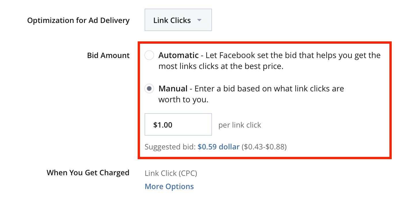
The optimization for the ad delivery plays an important role. It states the right period of time when the users see the ad.


